Proppio
Step into the bold and playful world of Proppio, where property selling and letting stand out with purpose and creativity.
PROJECT SUMMARY
Proppio is a free-to-list online property selling and letting platform. The brief was to create a new, exciting visual identity and brand positioning for the business to stand out with purpose in a saturated market.
The brand identity, system, and strategy enable the brand personality to be recognisable across all mediums and to elevate alongside the business through its successes. With clear positioning, a new name, strong brand values, and a playful and bold aesthetic, Proppio dominates with a clear structure, purposeful strategy, and creative brand presence.
SERVICES
Brand Strategy
Brand Consulting
Creative Direction
Brand Identity Design
Website Design

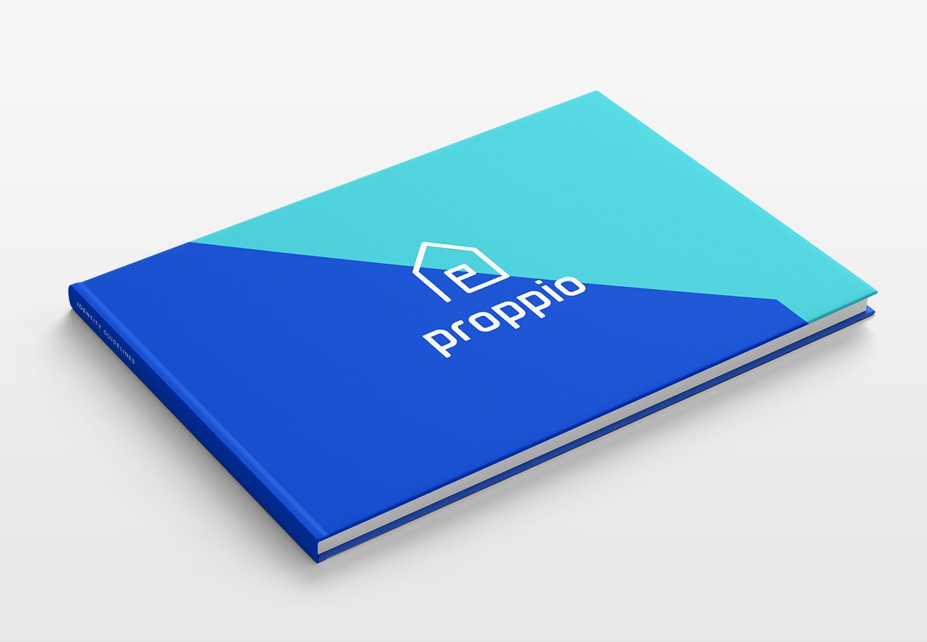
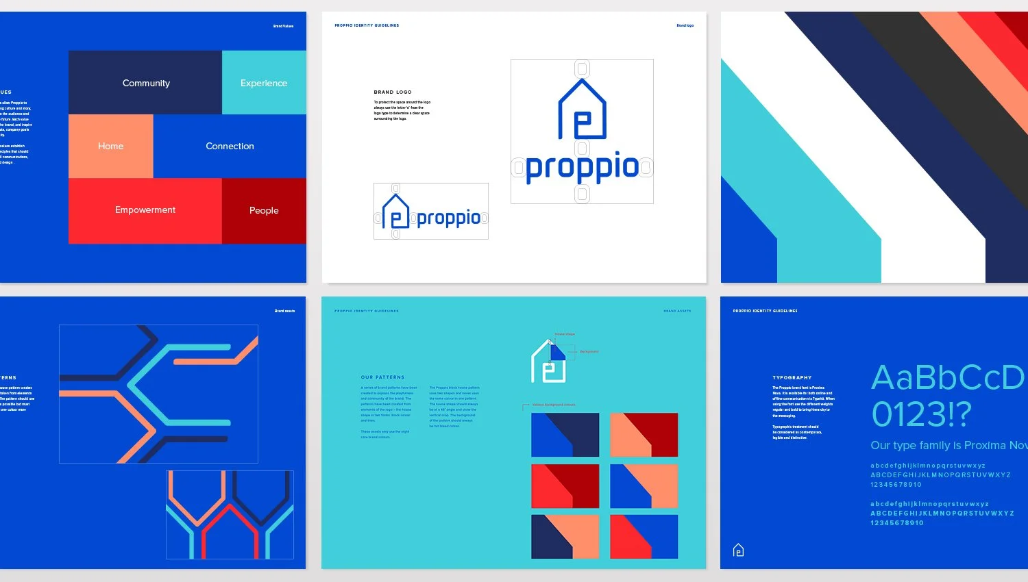
BRAND IDENTITY
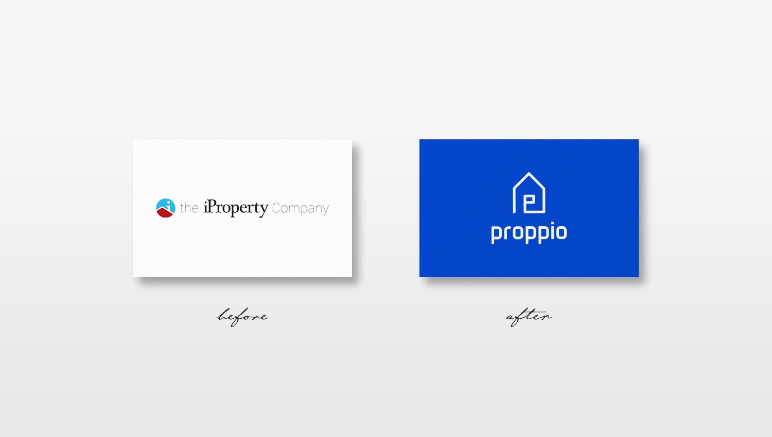
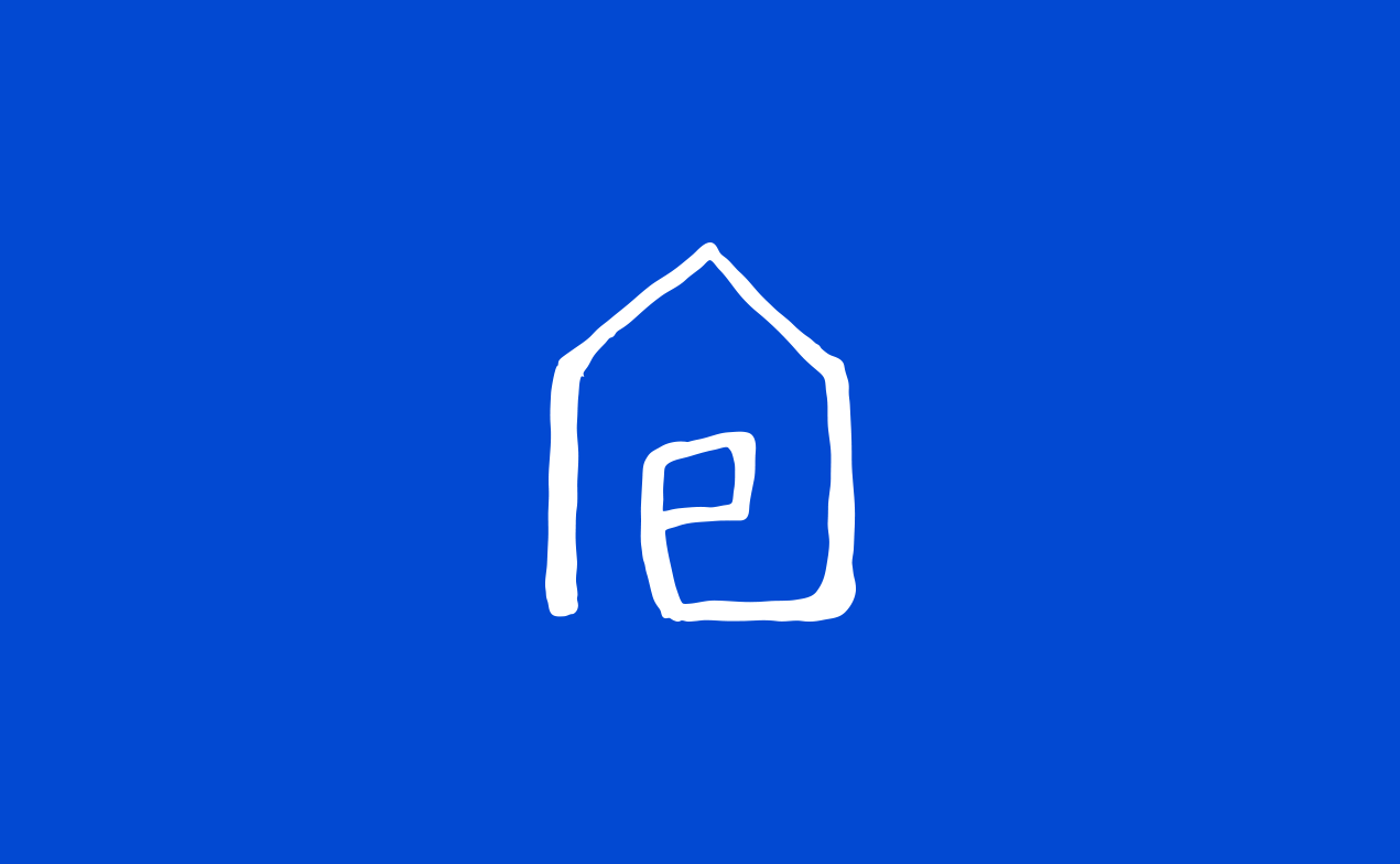
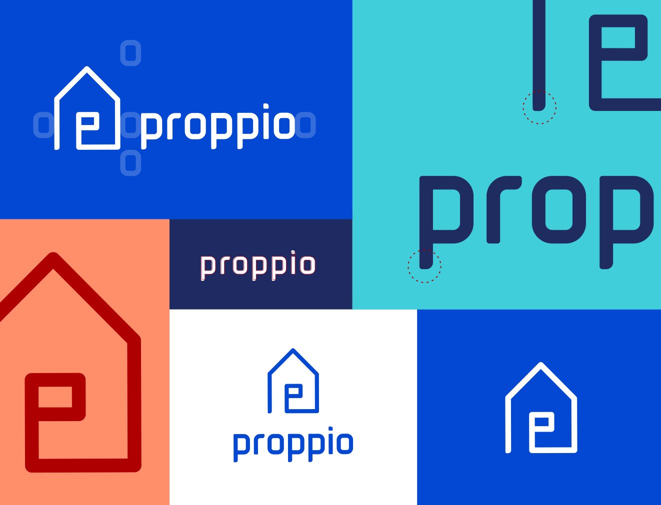
The new logo uses a continuous line to form a home, with a nod to the letter 'P' at the center, representing Proppio, People, and a 'For Sale' sign. The logo font was created as a bespoke logotype with a digital and contemporary aesthetic. The striking color palette and playful brand assets contribute to Proppio’s bold brand identity, expressing empowerment, community, and a fresh approach to the property industry. At the core of the brand identity concept is the idea of seamlessly bringing people and property together, empowering individuals to take control of buying and selling a home.
STRATEGY & BRAND COMMUNICATIONS
Proppio’s overall bright, flexible, and fresh visual identity is a bold new approach to the property industry, establishing and differentiating the brand in a highly competitive and saturated marketplace. This extends to the brand's values and tone of voice. The brand strategy holds everything together, providing a consistent reference and foundation for Proppio.

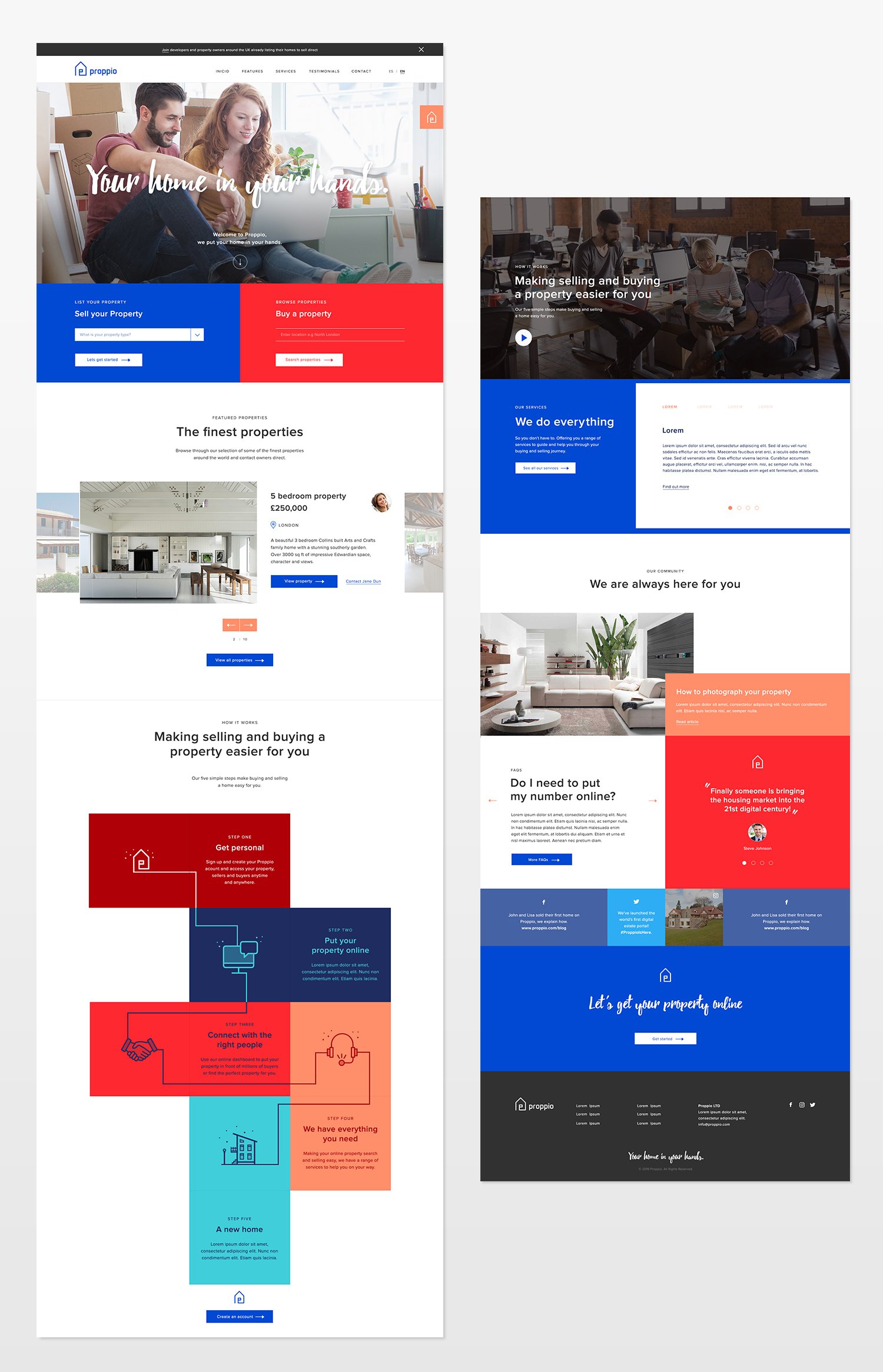
WEBSITE
Using the new brand identity, strategy, and tone of voice as the foundation, I designed a website that is fresh, modern, and playful. As Proppio is a digital business at its core, the website needed to be functional and user-friendly in every aspect. Throughout the site, there are interactive areas and guided, animated navigation, with a balance of flat colour panes and clear space to ensure content clarity without distraction.